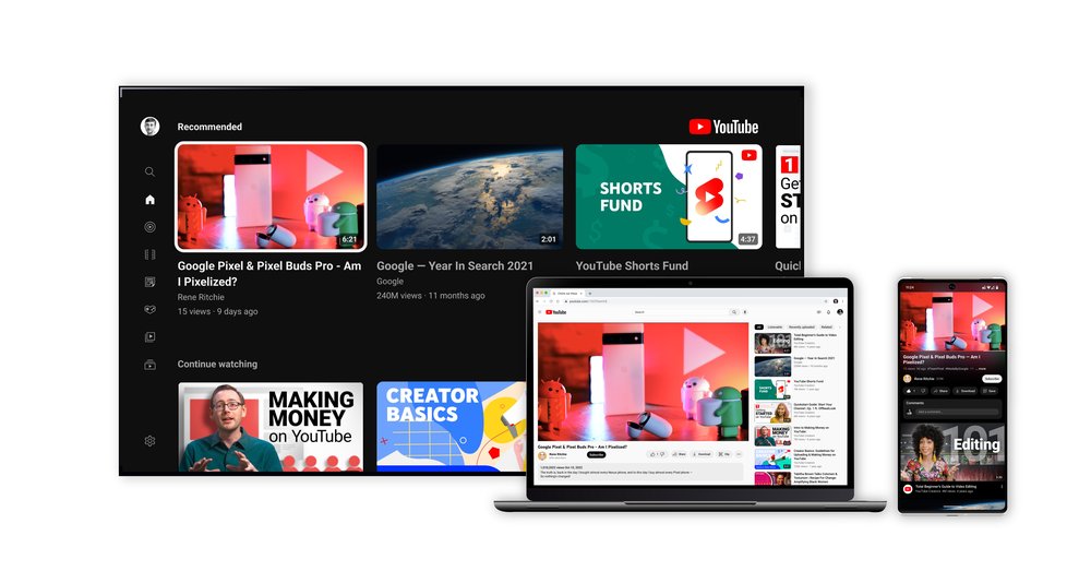
Starting today, YouTube has a new look and a number of new features that will improve the user experience by making streaming more modern and immersive. Recently, YouTube introduced channel handles for easier mentions.
A splash of color
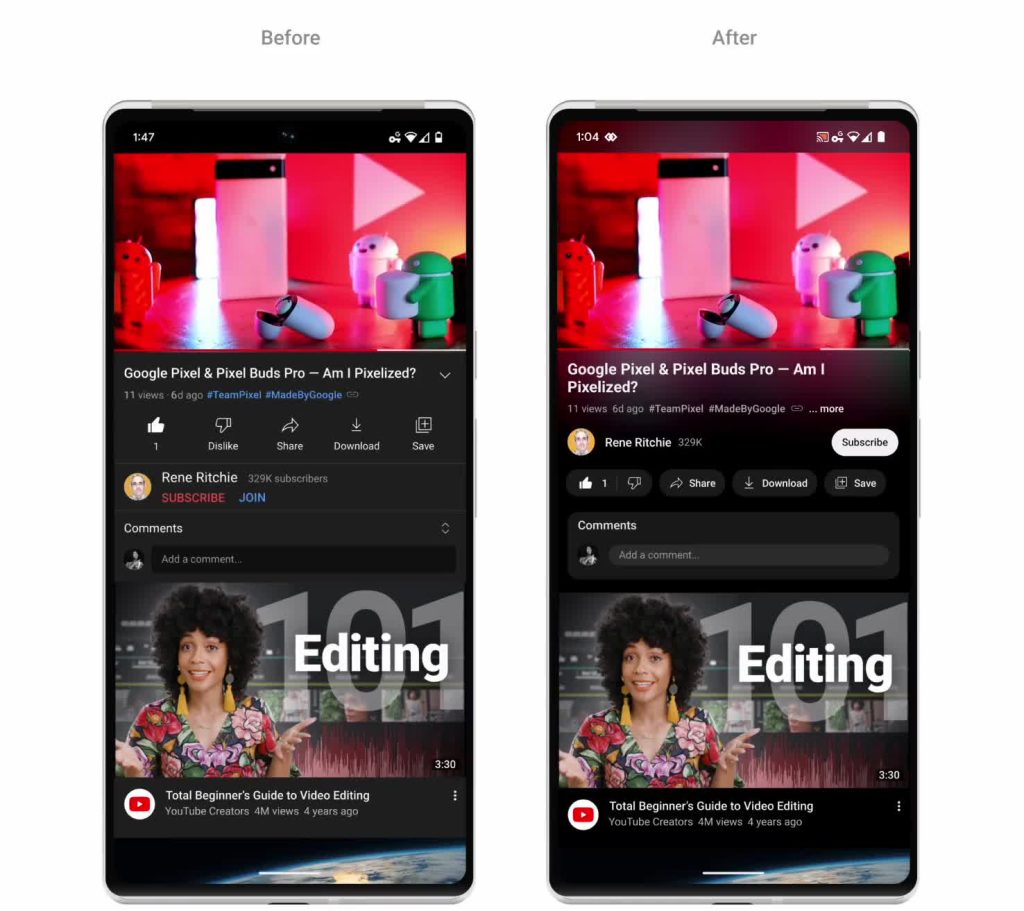
YouTube wanted to add colour to our apps without distracting viewers from their normal behavior’s, such as watching recommended videos or looking for new material. Ambient mode emerged from experimentation. “We knew we were on to something when users overwhelmingly liked the first design concept during testing,” says YouTube.
Ambient mode
Ambient mode subtly matches the app background colour to the video via dynamic colour sampling. The firm was inspired by the light screens cast in a gloomy room and wanted to mimic the look to lure visitors into the material and make the movie more prominent on our watch page. Dark-themed web and mobile devices will have this feature.
Video playlists
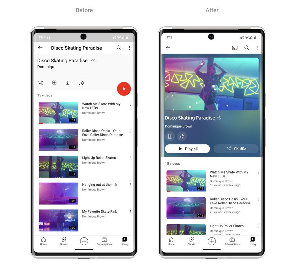
To make it easier for viewers to get started, video playlists will use the same colour scheme and now display additional information about each playlist.
Improvements Video player
Links to YouTube will no longer appear in video descriptions; instead, buttons will replace them. Additionally, typical actions like “like,” “share,” and “download” have been styled to reduce clutter. Even if the subscribe button is no longer red, it is now simpler to find and much more accessible to everyone on both watch sites and channel pages thanks to its new design and high contrast.
Pinch to zoom
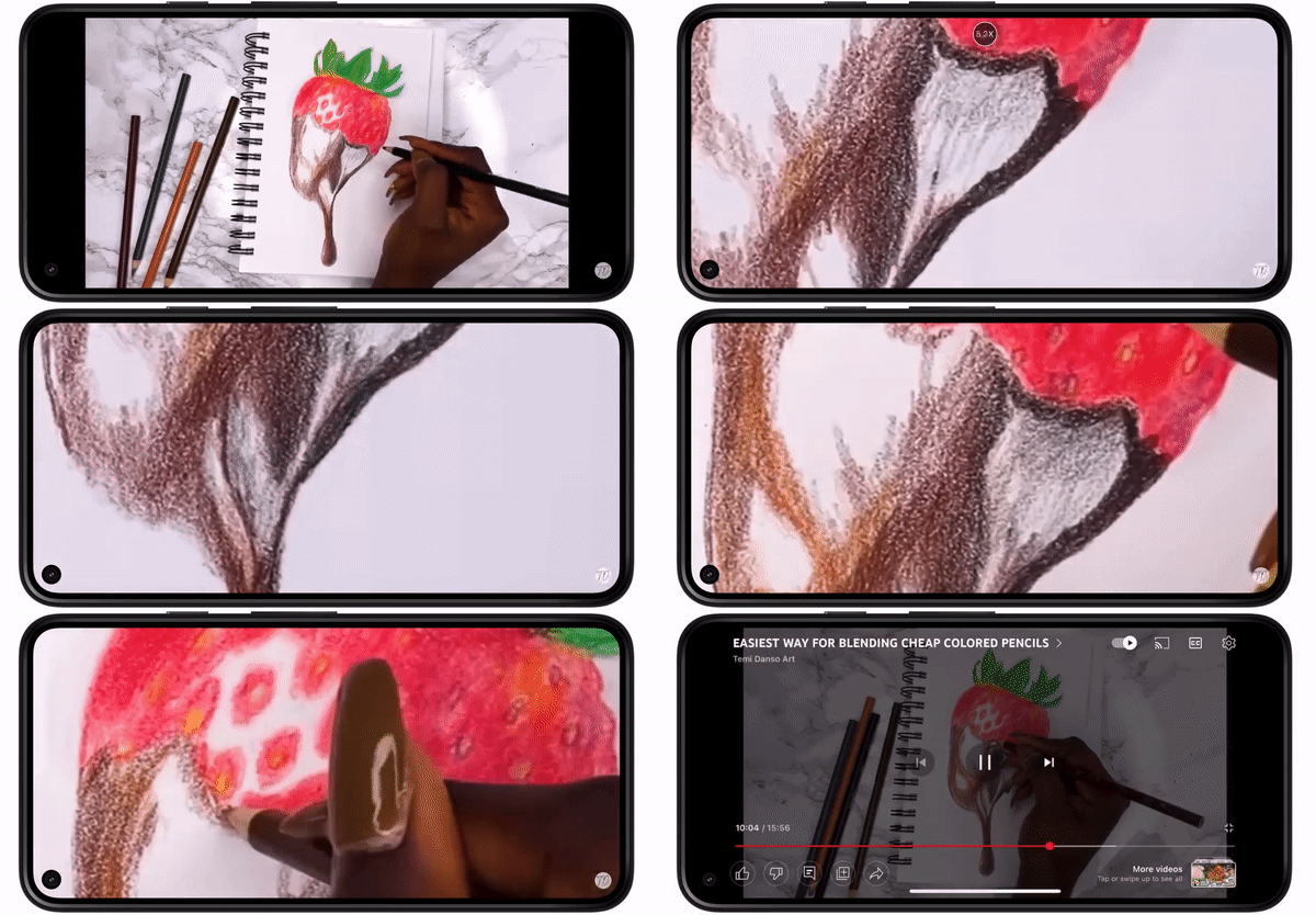
Users can now simply zoom in and out of a video on their iOS or Android phone by using the pinch to zoom feature. And when you let go, the video maintains its close-up, so you can watch the remainder of it in more detail.
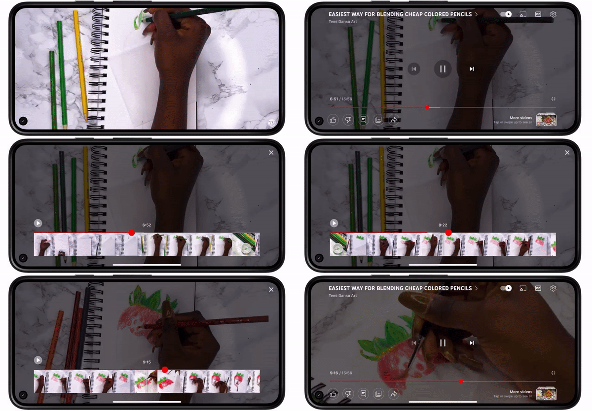
Precise seeking
Simply drag or swipe up while looking for a row of thumbnails to display in the video player on a desktop or mobile device to make fine-tuned modifications to get to the precise part in each movie.
Availability
All users will gradually start to experience these improvements over the next few weeks, starting today.
Speaking on the announcement, Neal Mohan, Chief Product Officer, YouTube, said:
When the first YouTube video was uploaded in 2005, YouTube had a search bar and a list of video tags on its homepage. Since then, you could say we’ve gone through some changes. In this latest installment of our Innovation series, we’re sharing a design update that will make YouTube more modern and bring new features to power the YouTube you know and love.